

Getting in Gear
While the concept of a publicly accessible, shared bike program has been skillfully (and successfully) implemented in large urban locales like Chicago and New York, Seattle presented unique challenges in climate, geography, and audience. Given the novelty of a bike share in the Seattle area, the focus of those leading communications and marketing efforts had been on engaging stakeholders – community leaders and investors – not end users. And Seattleites were notably wary of the feasibility of the program in the wake of several false starts.
The Puget Sound Bike Share needed to improve the city’s awareness of the up-and-coming transportation option and inspire confidence and excitement for the program among the likely cyclists of Seattle. Following audits of existing U.S. bike share programs and their respective markets, Urban Influence created an in-depth Brand Build, capturing what worked (and what didn’t) for competitors, and providing a framework for branding and marketing strategy.

Putting the Wheels in Motion
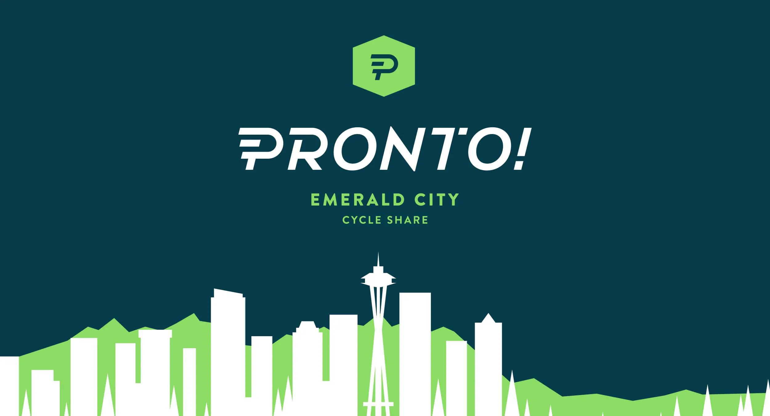
The best names are accessible and concise, but still reference and reinforce brand values in a meaningful way. The values of “active discovery” and “ease” were central to PSBS. And thus Pronto was born — fast, global, punchy, and easy to say for both locals and non-English speaking tourists.
Conveying a sense of movement, the logo’s custom type is clear and legible at all sizes. The hexagonal shape is reminiscent of a location icon, communicating a “You Are Here” vibe that appeals to the concept of travel and extends naturally to future brand efforts. The supporting type, Brandon Grotesque, is simple yet unique, and displays consistently across print and web applications. Top it all of with a quintessentially Seattle color palette, a meticulously branded infrastructure, and engagingly informative infographics, and you have a brand that’s ready to hit the streets.


“From day one, Urban Influence listened, and the result is a brand that feels timeless, local and unique, while appealing to an incredibly diverse audience. From the visual design to the personality and voice, every detail of the brand feels intentional and well thought out.”
-Holly Houser, Executive Director of Pronto


.webp)